Tuesday, November 23, 2010

Technology Isn’t Enough: NUI is in the Experience, not the Hardware

The first and most immediate point to understand is that technology is not, in and of itself, a natural user interface. Certain input technologies, such as those that detect touch, speech, and even in-air gestures, might lend themselves to building a NUI. But just because those modalities are used does not mean that a NUI will result.NUI lies in the experience that is built using the technology. Not in the technology itself.

To help to make that point, I thought I’d do a quick analysis of two existing products that use direct-touch, but which in some instances miss the mark of creating a NUI.

Direct Touch Enables Direct Manipulation – but does not Guarantee It

One of the tenets of the Microsoft Surface user experience guidelines is to use direct manipulation, a form of direct input. There are three different terms that use the word ‘direct’ with respect to touch input – let’s quickly define each:

Direct Touch: a touch input device that is co-incident with a display. The opposite of direct touch is indirect touch, where the touch input device is offset from the display – like the trackpad on a laptop.

Direct Input: a particular arrangement of direct touch is to map the input device 1:1 with the display device, so that actions performed on the screen are sent to the object beneath the finger. Other arrangements are possible, but uncommon. An example of where direct input is broken is in the Hybrid Pointing system – they allow users to reach far away on a large screen without having to walk across the room.

Direct Manipulation: a particular design approach that can be used when building an interface. It is a principal which says “anything on the screen I can touch to adjust”. For example, volume is changed on a screen by reaching out and touching the current volume indicator. To move something, one simply touches it and moves their finger across the screen. Somewhat perversely, one can build a direct manipulation system without using direct touch (or touch at all) – the windows volume control is a great example of direct manipulation. For a good touch experience, however, direct manipulation is essential – users have a greater expectation of direct manipulation with direct touch than with indirect input.

To fully understand why direct manipulation is important for touch, let’s take a look at two interfaces, where they accomplish direct manipulation, and where they don’t.

Case Study of Direct Input and Direct Manipulation: Chrysler MyGig

The MyGig system is a navigation and audio device that sits in my Jeep. The interface has a lot of trouble. It should be noted that the interface is not a study in great design. But for this article, it serves as a good example.

Like most direct touch systems, the MyGig universally uses a direct-input metaphor – touches to the screen are mapped to the object beneath the finger. The primary navigation screen, shown below, has three great examples to help understand the concept of direct manipulation:

clip_image002

The Chrysler myGig UI. Yes, I stopped at a light when I took the photo. Call-outs below.

The first obvious example of a failure to use direct manipulation is the use of a button to do zooming (#1). On multi-touch screens, zooming is accomplished with the classic two-finger zoom gesture (a friend of mine calls this the ‘swimming’ gesture), or with multi-tapping on the map directly. #1 shows the use of a button to select the zoom level, which the user then taps to bring up another control.

#2 shows a great use of direct manipulation. There’s the clock, hanging out on the bottom-left of the screen. Want to set the time? Just reach out and touch it. I sing a song of joy every time I do this. A complete interpretation of direct manipulation might allow you to move hands on an analog clock, or drag a virtual dial behind each digit (a la the iPhone time picker). I won’t get into the mechanics of the Jeep’s time setter – suffice to say they don’t follow direct manipulation entirely. But, understand the essence of the idea here – the time is shown on the display. To change it, you touch it. Wow.

#3 shows a missed opportunity. The current radio station is shown on the screen. Given the great use of direct manipulation for the clock, one might have hoped they’d keep it up. The screen shows the current radio station. Want to change the radio station? Just reach out and touch it, right? Alas, no – tapping that readout does absolutely nothing. Following the principal of direct manipulation, touching there would provide an opportunity to change the station. We get three problems for the price of one: first, that there is missing direct manipulation on the radio station. Second, that there is obvious inconsistency in the navigation scheme – sometimes I touch the thing I want to change, other times I have to go elsewhere. The third problem is that touching the station doesn’t do anything at all. It doesn’t provide a message (“this is not how you set the station”), it doesn’t beep, it doesn’t do anything. My input gets ignored, and I get frustrated.


Case Study of Direct Input and Direct Manipulation: Cybershot DSC-TX1

I was recently given this Cybershot digital camera as a gift. Like the iPhone and the new Zune HD, this device uses touch as its input modality to enable a very large display. It’s a beautiful piece of technology – an excellent execution of industrial design. Like the MyGig, the interface has elements where direct manipulation are executed, and elements where they missed the boat.

clip_image004 clip_image006

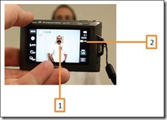
Sony’s Cybershot camera has a touch screen, implements direct input, and sometimes (but not consistently) uses direct manipulation. Call-outs below.

 There are two great moments of both success and failure to implement direct manipulation on the Cybershot camera. #1 shows an amazingly awesome feature: anywhere in the field of view, the user can tap to select where to focus. A few days ago I needed to take a picture of my VIN through my windshield. The darn thing kept focusing on reflections on the window. Then I remembered this feature – I just tapped where the VIN was shown in its blurry glory – and voila! Instant focusing awesomeness.

#2 shows a failure of the same kind as the myGig. Look carefully, and you’ll see that on the display it shows both the resolution I have selected (3MP), and the aspect ratio (4:3). These are settings that can be changed. But, when I touch this display, nothing happens. Instead, I have to dig my way through menus to tell the interface which element I want to change – instead of just touching the darn pixels that are being used to show me the information. Sigh.

A NUI Design Principle: No Touch Left Behind

We at Surface had a principle which has helped us to do our design work: leave no touch behind. What that means in practice is that every touch to the screen should do something consistent with the principle of direct manipulation. We also have a visualization system that will do the bare minimum: acknowledge that the touch was seen, but that the system is not going to respond. Obviously, the ideal would be for all applications built on our platform to adhere to our principle, but the contact visualizer at least reduces the impact of a failure to do so. Check out the video:

Published at ACM UIST, “Ripples” was the research name for NTLB. Surface’s Contact Visualizer ensures that every touch receives a visual response – and is customized to provide a range of feedback.

From Touch to Voice: The “Direct” Voice Response Interface

Ultimately, the principle of direct manipulation is not limited to touch. We can apply it equally to other modalities. To understand how, consider three possible voice response systems:

a. “For sales, say “1”, for support, say ‘2’,…”

b. “Which would you like: you can say ‘sales’, ‘support’,…”

c. “How can I help you?”

Setting aside how well the technology enables each of these, consider how ‘direct’ the mapping is in each of these cases between the user’s goal and what they have to give as input. Clearly, #c is the most ‘direct’ – the user thinks about what they want, and they say it. There is no rephrasing the query in the system’s terms. #a is the least direct, since the input is a completely arbitrary mapping between the goal and the input.

As you and your teams build-out your NUI experiences, think about how the principle of direct manipulation can help you to make easier, more natural mappings between input and desired goal. Understand that this may well require you to provide on-screen affordances – don’t be shy about this. A “Natural” user interface does not mean the absence of digital information – it simply means that the mapping is one that can be quickly understood.

Final Word: Technology Ain’t NUI, and NUI Ain’t Technology

Ultimately, whether or not the experience is a ‘natural’ one is a function of the design of that experience. I believe strongly that a Natural User Interface could well be created for a mouse and keyboard. Certainly, there are modalities that lend themselves more easily to natural experiences, but without proper software design, a NUI you will not have.

Sunday, November 15, 2009

Indirect Touch is Better than Direct Touch (sometimes)

In the broadest sense, touch as a technology refers to the response of an input device without having to depress an actuator. The advent of technologies which allow displays and input devices to overlap have given rise to direct touch input. With direct touch, we apply the effect of a touch to the area of the screen beneath the finger(s). This gives rise to claims of ‘more natural’ computing, and enables certain types of devices to be better (such as mobile devices, like the Zune or a Windows Mobile phone). Direct touch, however, introduces a host of problems that make it ill suited to most applications.

What’s With Direct Touch?

I recently attended a presentation in which the speaker described a brief history Apple’s interaction design. The speaker noted that the iPhone’s touch interface was developed in response to the need for better input in the phone.

Phewy.

The iPhone’s direct-touch input was born of a desire to make the screen as large as possible. By eliminating a dedicated area for input, Apple could cover the whole of the front of the device with a big, beautiful screen (don’t believe me? Watch Jobs’ keynote again). The need to constantly muck-up your screen with fingerprints is a consequence of the desire to have a large display – not a primary motivator. Once we understand this, we understand the single most important element of direct touch: it allows portable devices to have larger screens. But it also has a litany of negative points:

  • Tiring for large and vertical screens (the Gorilla Arm effect)
  • Requires users to occlude their content in order to interact with it (leading to the ‘fat finger problem’.
  • Does not scale up well: human reach is limited
  • Does not scale down well: human muscle precision is limited

There is also some evidence that direct touch allows children to use computers at a younger age, that older novice computer users can use it more quickly. Direct-touch has also demonstrated utility in kiosk applications, characterized by short interaction periods and novice users. We on the Surface team also believe that direct-touch is suitable for certain scenarios involving sustained use. Clearly, direct-touch is far from being the be-all and end-all input technique – it has a whole host of problems that make it ill suited to a number of scenarios.

What’s with Indirect Touch?

Indirect touch overcomes most of the negatives of direct touch.

  • Scalable both up and down with C/D Gain (aka ‘mouse speed’ in windows – ‘touch speed’ in Windows 8?)
  • Enables engaging interactions in the same way direct-touch does
  • Fingers do not occlude the display when using
  • Not tiring if done correctly: with the right scale factor (C/D gain) a large area can be affected with small movements

Revolutionary Indirect Touch

Indirect touch enables a host of scenarios not possible with direct touch, many of which are much more compelling. Our first example <REDACTED FROM PUBLIC VERSION OF THE BLOG. MSFT EMPLOYEES CAN VIEW THE INTERNAL VERSION>

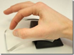
While exciting and low-tech, it should be noted that this demo is ‘single touch’ (not multi-touch). So, what would indirect multi-touch look like? Let’s take a look at three examples. The first is again from a teaming of MS Hardware and MSR: Mouse 2.0. Mouse 2.0 is a multi-touch mouse that enables multi-touch gestures on a mouse. Right around the time this research paper was published at ACM UIST, Apple announced their multi-touch mouse. While both are compelling, Mouse 2.0 offers several innovations that the Apple mouse lacks. Note the mixing of two different forms of indirect interaction: the mouse pointer and ‘touch pointer’:

clip_image006

Figure 2: Mouse 2.0 adds multi-touch capabilities to the world’s second most ubiquitous computer input device.

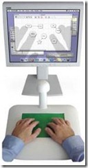
Indirect touch is also highly relevant for very large displays. In this system, a user sits at a table in front of a 20’ high-resolution display. Instead of having to walk across the room to use the display, the user sits and performs indirect touch gestures. The left hand positions the control area on the display, and the right hand performs touch gestures within that area. This demonstrates how indirect touch is far more scalable than direct touch, and also shows a good way to use two hands together:

clip_image008

Figure 3: Two-handed indirect touch interaction with very large displays.

Also for large displays: this time, televisions. An indirect touch project from Panasonic shows how we can get rid of the mass of buttons on a remote control: display only the buttons that you need at the moment. To allow this to be done cheaply, they built a remote control that has only two touch sensors (with actuators, so that you can push down to select). The visual feedback is shown on the screen:

clip_image010

Figure 4: Panasonic’s prototype remote control has no buttons: the interface is shown on the TV screen, customized for the current context of use.

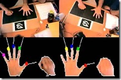
Finally, the TactaPad, which demonstrates how indirect multi-touch interaction could be done to enable existing applications without the many drawbacks of direct touch. The TactaPad uses vision and a touch pad to create a device that can detect the position of the hands while in the air, and send events to targeted applications when the user touches the pad. While less subtle, this starts to show how a generic indirect multi-touch peripheral might behave in an existing suite of applications:

clip_image012

Figure 5: the TactaPad provides an indirect touch experience to existing applications.

From this grab-bag of indirect touch projects, we can start to see a pattern emerge: direct touch is appropriate for some applications, but is absolutely the wrong tool for others. Indirect touch fills the many voids left by direct touch. Indirect touch interaction allows users to operate at a distance, to scale their interactions, and to work in a less tiring way. If touch is the future of interaction, indirect touch is the way it will be achieved. Apple’s trackpad features a set of indirect touch gestures that their customers use every day to interact with their macbook. My girlfriend recently turned down a bootcamp install of Windows 7 because it doesn’t support her trackpad gestures:

clip_image014

clip_image016

clip_image018

clip_image020

clip_image022

clip_image024

These gestures are usable (natural? No such thing) and definitely useful. As always, the key to success is a real understanding of user needs and the fundamentals of available technologies. From there, we can begin to design software and hardware solutions to those needs in a way that provides an exciting, compelling, and truly useful experience.

Wednesday, September 30, 2009

The Myth of the Natural Gesture

This entry is meant to address a myth that we encounter time and again: the Myth of the Natural Gesture.

The term “Natural User Interface” evokes mimicry of the real world. A naïve designer looks only to the physical world, and copies it, in the hopes that this will create a natural user interface. Paradoxically to some, mimicking the physical world will not yield an interface that feels natural. Consider two examples to illustrate the point.

First, consider the GUI, or graphical user interface. Our conception of the GUI is based on the WIMP toolset (windows, icons, menus, and pointers). WIMP is actually based on a principal of ‘manipulation’, or physical movement of objects according to naïve physics. The mouse pointer is a disembodied finger, poking, prodding, and dragging content around the display. In short, if ‘natural’ means mimicking nature, we did that already – and it got us to the GUI.

Second, consider the development of the first generation Microsoft Surface gestures. The promise of the NUI is an interface that is immediately intuitive, with minimum effort to operate. In designing Surface gestures, we once constantly asked: “what is natural to the user?” This question is a proxy for “what gesture would the user likely perform at this point to accomplish this task?” In both cases, this is the wrong question. Here’s why:

Imagine an experiment intended to elicit the ‘natural’ gesture set – that set of gestures users would perform without any prompting. You might design it like this: show the user screen shots of your system before and after the gesture is performed. Then, ask them to perform the gesture that they believe would cause that transition. Here’s an example:

clip_image002Figure 1. 3 different pairs of images: the screen before (left) and after (right) a gesture was performed. What gesture would you use? Almost all of you would perform the same gesture for example 1. About half of you would perform the same gesture for example 2. Example 3 is all over the map.

In two experiments conducted by teams at both Microsoft Surface and MSR, there was found almost no congruence between any user-defined gestures for even the simplest of operations (MSR work).

A solution to this lies in the realization that both studies were intentionally done free of context: no on-screen graphics to induce a particular behaviour. Imagine trying to use a slider from a GUI without a thumb painted on the screen to show you the level, induce behaviour (drag), and give feedback during the operation so you know when to stop. As we develop NUI systems, they too will need to provide different affordances and graphics.

So, if you find yourself trying to define a gesture set for some platform or experience, you should consider the universe you have built for your user – what do the on-screen graphics afford them to do? User response is incredibly contextual. Even in the real world, a ‘pick up’ gesture is different for the same object when it has been super-heated. If there is not an obvious gesture in the context you have created, it means the rules and world you have built is incomplete: expand it. But don’t try to fall back to some other world (real or imagined).

While the physical world and previous user experience provides a tempting target, a built-world with understood rules that will elicit likely responses, relying on that alone in building a user interface will be disastrous – because only one gesture is actually ‘natural’. Relying on some mythical ‘natural’ gesture will only yield frustration for your users.

Monday, June 15, 2009

Why are Surface and Windows 7 Gestures Different?

My commitments include driving towards a standardized gesture language across Microsoft. Given this, someone asked me recently: why are the gestures across our products not the same, and why are you designing new gestures for Surface that aren’t the same as those in Windows?

The answer is in two parts. The first is to point out that manipulations, a specific type of gesture, are standardized across the company, or in the process of being standardized. The manipulation processor is a control in a bunch of different platforms, including both Microsoft Surface and Windows 7. The differences lie in non-manipulation gestures (what I have previously called ‘system gestures’). So – why are we developing different non-manipulation gestures than are included in Win 7?

Recall: Anatomy of a Gesture

Recall from a previous post that gestures are made-up of three parts: registration, continuation, and termination. For the engineers in the audience, a gesture can be thought of as a function call: the user selects the function at the registration phase, they specify the parameters of the function during the continuation phase, and the function is executed at the termination phase:

clip_image002

Figure 1: stages of a gesture: registration (function selection), continuation (parameter specification), termination (execution)

To draw from an example you should all now be familiar with, consider the two-finger diverge (‘pinch’) in the manipulation processor – see the table below. I put this into a table in the hopes you will copy and paste it, and use it to classify your own gestures in terms of registration, continuation, and termination actions.

Gesture Name

Logical Action

Registration

Continuation

Termination

ManipulationProcessor/Pinch

Rotates, resizes, and translates (moves) an object.

Place two fingers on a piece of content.

Move the fingers around on the surface of the device: the changes in the length, center position, and orientation of the line segment connecting these points is applied 1:1 to each of scale (both height and width), center position, and orientation of the content.

Lift the fingers from the surface of the device.

Table 1: stages of multi-touch gestures.

Avoiding Ambiguity

The design of the manipulation processor is ‘clean’, in a particularly nice way. To understand this, consider our old friend the Marking Menu. For those not familiar, think of it as a gesture system in which the user flicks their pen/finger in a particular direction to execute a command (there is a variation of this in Win 7, minus the menu visual):

clip_image004

Figure 2: Marking menus

Keeping this in mind, let’s examine the anatomy of a theoretical ‘delete’ gesture:

Gesture Name

Logical Action

Registration

Continuation

Termination

Theoretical/Delete

Delete a file or element.

1. Place a finger on an item

2. Flick to the left

None.

Lift the finger from the surface of the device.

Table 2: stages of the WM_Gesture/Delete function.

Two things are immediately apparent. The first is that there is no continuation phase of this gesture. This isn’t surprising, since the delete command has no parameters – there isn’t more than one possible way to ‘delete’ something. The second striking thing is that the registration requires two steps. First, the user places their hand on an element, then they flick to the left.

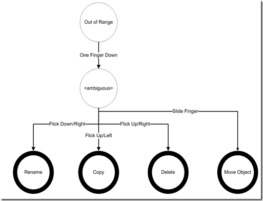
Requiring two steps to register a gesture is problematic. First, it increases the probability of an error, since the user must remember multiple steps. Second, error probability is also increased if the second step has too small a space relative to other gestures (eg: if there are more than 8 options in a marking menu). Third, it requires an explicit mechanism to transition between registration and continuation phases: if flick-right is ‘resize’, how does the user then specify the size? Either it’s a separate gesture, requiring a modal interface, or the user will keep their hand on the screen, and require a mechanism to say ‘I am now done registering, I would like to start the continuation phase’). Last, the system cannot respond to the user’s gesture in a meaningful way until the registration step is complete, and so this prolongs this feedback. Let’s consider a system which implements just 4 gestures: one for manipulation of an object (grab and move it), along with 3 for system actions (‘rename’, ‘copy’, ‘delete’) using flick gestures. We can see the flow of a user’s contact in Figure 3. When the user first puts down their finger, the system doesn’t know which of these 5 gestures the user will be doing, so it’s in the state labelled ‘<ambiguous>’. Once the user starts to move their finger around the table in a particular speed and direction (‘flick left’ vs. ‘flick right’) or pattern (‘slide’ vs. ‘question mark’), the system can resolve that ambiguity, and the gesture moves into the registration phase:

image

Figure 3: States of a hand gesture, up to and including the end of the Registration phase – continuation and termination phases are not shown.


Gesture Name

Logical Action

Registration

Continuation

Termination

Theoretical/Rename

Enter the system into “rename” mode (the user then types the new name with the keyboard).

1. Place a finger on an item

2. Flick the finger down and to the right

None.

Lift the finger from the surface of the device.

Theoretical/Copy

Create a copy of a file or object, immediately adjacent to the original.

1. Place a finger on an item

2. Flick the finger up and to the left

None.

Lift the finger from the surface of the device.

Theoretical/Delete

Delete a file or element.

1. Place a finger on an item

2. Flick the finger up and to the right

None.

Lift the finger from the surface of the device.

ManipulationProcessor/Move

Change the visual position of an object within its container.

1. Place a finger on an item

2. Move the finger slowly enough to not register as a flick.

Move the finger around the surface of the device. Changes in the position of the finger are applied 1:1 as changes to the position of the object.

Lift the finger from the surface of the device.

Table 3: stages of various theoretical gestures, plus the manipulation processor’s 1-finger move gesture.

Consequences of Ambiguity

Let’s look first at how the system classifies the gestures: if the finger moves fast enough, it is a ‘flick’, and the system goes into ‘rename’, ‘copy’, or ‘delete’ mode based on the direction. Consider now what happens for the few frames of input while the system is testing to see if the user is executing a flick. Since it doesn’t yet know that the user is not intending to simply move the object quickly, there is ambiguity with the ‘move object’ gesture. The simplest approach is for the system to assume each gesture is a ‘move’ until it knows better. Consider the interaction sequence below:

1

clip_image008

2

clip_image010

3

clip_image012

Figure 4: Interaction of a ‘rename’ gesture: 1: User places finger on the object. 2: the user has slid their finger,
with the object following-along. 3: ‘rename’ gesture has registered, so the object pops back to its original location

Because, for the first few frames, the user’s intention is unclear, the system designers have a choice. Figure 4 represents one option: assume that the ‘move’ gesture is being performed until another gesture gets registered after analyzing a few frames of input. This is good, because the user gets immediate feedback. It’s bad, however, because the feedback is wrong: we are showing the ‘move’ gesture’, but they’re intending to perform a ‘rename’ flick. The system has to undo the ‘move’ at the time of registration of rename, and we get an ugly, popping effect. This problem could be avoided: provide no response until the user’s action is clear. This would correct the bad feedback in the ‘rename’ case, but consider the consequence for the ‘move’ case:

1

clip_image013

2

clip_image015

3

clip_image017

Figure 4: Interaction of a ‘move’ gesture in a thresholded system: 1: User places finger on an object. 2: slides finger along surface.
The object does not move because the ‘flick’ threshold is known to have not been met. 3: object jumps to catch-up to the user’s finger.

Obviously, this too is a problem: the system does not provide the user with any feedback at all until it is certain that they are not performing a flick.

The goal, ultimately, is to avoid the time that the user’s intention is ambiguous. Aside from all of the reasons outlined above, it also creates a bad feedback situation. The user has put their finger down, and it has started moving – how soon does the recognizer click over to “delete” mode, vs. waiting to give the user a chance to do something else? The sooner it clicks, the more likely there will be errors. The later it clicks, the more likely the user will get ambiguous feedback. It’s just a bad situation all around. The solution is to tie the registration event to the finger-down event: as soon as the hand comes down on the display, the gesture is registered. The movement of the contacts on the display is used only for the continuation phase of the gesture (ie specifying the parameter).

Hardware Dictates What’s Possible

Obviously, the Windows team are a bunch of smart cats (at least one of them did his undergrad work at U of T, so you know it’s got to be true). So, why is it that several of the gestures in Windows 7 are ambiguous at the moment of contact-down? Well, as your mom used to tell you, ‘it’s all about the hardware, stupid’. The Windows 7 OEM spec requires that hardware manufacturers only sense two simultaneous points of contact. Further, the only things we know about those points of contact are their x/y position on the screen (see my previous article on ‘full touch vs. multi-touch’ to understand the implications). So, aside from the location of the contact, there is only 1 bit of information about the gesture at the time of contact down – whether there are 1 or 2 contacts on the display. With a message space of only 1 bit, it’s pretty darn hard to have a large vocabulary. Of course, some hardware built for Win7 will be more enabled, but designing for all means optimizing for the least.

In contrast, the next version of Microsoft Surface is aiming to track 52 points of contact. For a single hand, that means we have 3 bits of data about the number of contacts. Even better, we will have the full shape information about the hand – rather than using different directions of flick to specify delete vs. copy, the user simply pounds on the table with their closed fist to delete, and full-hand diverge to copy (as opposed to two-point diverge which is “pinch”, as described above). It is critical to our plan that we fully leverage the Microsoft Surface hardware to enable a set of gestures with fewer errors and a better overall user experience.

How will we Ensure A Common User Experience?

Everyone wants a user experience that is both optimal and consistent across devices. To achieve this, we are looking to build a system that will support both the Win 7 non-manipulation gesture language, as well as our shape-enabled system to navigate. The languages will co-exist, and we will utilize self-revealing gesture techniques to transition users to the more reliable Surface system. Further, we will ensure that the surface equivalents are logically consistent: users will learn a couple of rules, and then simply apply those rules to remember how to translate Win 7 gestures into Surface gestures.

Our Team's Work

Right now, we are in the process of building our gesture language. Keep an eye on this space to see where we land.

Wednesday, April 15, 2009

What Gesture do I Use for “MouseOver”?

Recently, a PM on my team asked me this question – he was working with a group of people trying to make an application for Microsoft Surface, who had designed their application, and suddenly realized that they had assigned reactions for ‘MouseOver’ that could now not be mapped to anything, since Surface does not have a ‘hover’ event.

Boy, was this the wrong question!

What we have here is a fundamental misunderstanding of how to do design of an application for touch. It’s not his fault – students trained in design, cs, or engineering build applications against the mouse model of interaction so often, they become engrained assumptions about the universe in which design is done. We have found this time and again when trying to hire onto the Surface team: a designer will present an excellent portfolio, often with walkthroughs of webpages or applications. These walkthroughs are invariably constructed as a series of screen states – and what transitions between them? Yep – a mouse click. The ‘click’ is so fundamental, it doesn’t even form a part of the storyboard – it’s simply assumed as the transition.

As we start to build touch applications, we need to start to teach lower-level understanding of interaction models and paradigms, so that the design tenets no longer include baseline assumptions about interaction, such as the ‘click’ as transition between states.

Mouse States and Transitions vs. Touch States & Transitions

Quite a few years ago, a professor from my group at U of T (now a principal researcher at MSR), published a paper describing the states of mouse interaction. Here’s his classic state diagram, re-imagined a little with different terminology to make it more accessible:

image

Figure 1. Buxton’s 3-state model of 1-button mouse hardware

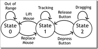
This model describes the three states of the mouse. State 0 is when the mouse in the air (not tracking – sometimes called ‘clutching’, often done by users when they reach the edge of the mouse pad). State 1 is when the mouse is moving around the table, and thus the pointer is moving around the screen. This is sometimes called “mouse hover”. State 2 is when a mouse button has been depressed. Technically, it’s possible to transition directly between states 0 and 2 (by pressing a button when the mouse is in the air).

As Bill often like’s to point out, the transitions are just as, if not more important than the states themselves. It is the transitions between states that usually evoke events in a GUI system: transition from state 1 to 2 fires the “button down” event in most systems. 2-1 is “button up”. A 1 à 2 à 1 transition is a “click”, if done with no movement and in a short period off time.

Aside for the real geeks: the model shown in Figure 1 is a simplification: it does not differentiate between different mouse buttons. Also, it is technically possible to transition directly between states 0 and 2 by pushing the mouse button while the mouse is being held in the air. These and many other issues are addressed in the paper – go read it for the details, there’s some real gold.

The problem the PM was confronting becomes obvious when we look at the state diagram for a touch system. Most touch systems have a similar, but different state diagram:

image

Figure 2. Buxton’s 2-state model of touch input: state names describe similar states from the mouse model, above.

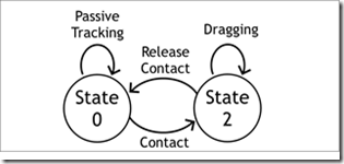
As we can see, most touch systems have only 2-states: State 0, where the finger is not sensed, and State 2, where the finger is now on the display. The lack of a State 1 is highly troubling: just think about all of the stuff that GUI’s do in State 1: the mouse pointer gives a preview of where selection will happen, making them more precise. Tooltips are shown in this state, as are highlights to show the area of effect when a mouse is clicked. I like to call these visuals “pre-visualizations”, or visual previews of what the effect of pushing the mouse button will be.

We saw in my article on the Fat Finger Problem that the need for these pre-visualizations is even more pronounced on touch systems, where precision of selection is quite difficult.

Aside for the real geeks: the model of a touch system described in Figure 2 is also a simplification: it is really describing a single-touch device. To apply this to multi-touch, think of these as states of each finger, rather than of the hardware.

There are touch systems which have a ‘hover’ state, which sense the location of fingers and/or objects before they touch the device. I’ll talk more about the differences in touch experiences across hardware devices in a future blog post.

Touch and Mouse Emulation: Doing Better than the Worst (aka: Why the Web will Always Suck on a Touch Screen)

We’ll start to see a real problem as there are increasingly two classes of devices browsing the web at the same time: touch, and mouse. Webpage designers are often liberal in their assumptions of the availability of a ‘mouse over’ event, and there are examples of websites that can’t be navigated without it (Netflix.com leaps to mind, but there are others). It is in these hybrid places that we’ll see the most problems.

When I taught this recently to a class of undergrads, one asked a great question: the trackpad on her laptop also had only two states, so why is this a problem for direct-touch, but not for the trackpad? The answer lies in understanding how the events are mapped between the hardware and the software. In the case of a trackpad, it emulates a 3-state input device in software: the transitions between states 1 and 2 are managed entirely by the OS. It can be done with a physical button beside the trackpad (common), or operated by a gesture performed on the pad (‘tapping’ the pad is the most common).

In a direct-touch system, this is harder to do, but not impossible. The trick lies in being creative in how states of the various touchpoints are mapped onto mouse states in software. The naïve approach is to simply overlay the touch model atop the mouse one. This model is the most ‘direct’, because system events will continue to happen immediately beneath the finger. It is not the best, however, because it omits state 1 and is imprecise.

The DT Mouse project from Mitsubishi Electric Research Labs is the best example of a good mapping between physical contact and virtual mouse states. DT Mouse was developed over the course of several years, and was entirely user-centrically designed, with tweaks done in real time. It is highly tuned, and includes many features. The most basic is that it has the ability to emulate a hover state – this is done by putting two fingers down on the screen. When this is done, the pointer is put into state 1, and positioned between the fingers. The transition from state 1 to 2 is done by tapping a third finger on the screen. An advanced user does this by putting down her thumb and middle finger, and then ‘tapping’ with the index finger:

imageimage

Figure 3. Left: The pointer is displayed between the middle finger and thumb.
Right: the state 1à transition is simulated when the index finger is touched to the display

So, now we see there are sophisticated ways of doing mouse emulation with touch. But, this has to lead you to ask the question: if all I’m using touch for is mouse emulation, why not just use the mouse?

Design for Touch, Not Mouse Emulation

As we now see, my PM friend was making a common mistake: he started by designing for the mouse. In order to be successful, designers of systems for multi-touch applications should start by applying rules about touch, and assigning state changes to those events that are easily generated using a touch system.

States and transitions in a touch system include the contact state information I have shown above. In a multi-touch system, we can start to think about combining the state and location of multiple contacts, and mapping events onto those. These are most commonly referred to as gestures – we’ll talk more about them in a future blog post.

For now, remember the lessons of this post:

  1. a. Re-train your brain (and the brains of those around you) to work right with touch systems. It’s a 2-state system, not a 3-state one.
  2. b. Mouse emulation is a necessary evil of touch, but definitely not the basis for a good touch experience. Design for touch first!

Our Team’s Work

The Surface team is tackling this in two ways: first, we’re designing a mouse emulation scheme that will take full advantage of our hardware (the Win 7 effort, while yielding great results, is based on more limited hardware). Second, we are developing an all-new set of ‘interaction primitives’, which are driven by touch input. This means the end of ‘mouse down’, ‘mouse over’, etc. They will be replaced with a set of postures, gestures, and manipulations designed entirely for touch, and mapped onto events that applications can respond to.

The first example of this is our ‘manipulation processor’, which maps points of contact onto 2-dimensional spatial manipulation of objects. This processor has since been rolled out into Win 7, windows mobile, and soon into both .NET and WPF. Look for many more such contributions to NUI from our team moving forward.

Monday, December 15, 2008

Selecting Selection Events

One of the most fundamental issues in any object-based interaction paradigm, be it GUI or NUI, is the issue of selection. It isn’t sexy, but it is an incredibly important piece to get right – and many, many touch systems get it wrong. The solution for mice is so engrained in our thinking that it can be difficult to understand what the issue is at all. To select something in a mouse-based system, the user positions the pointer above the object to be selected, depresses the mouse button, then, without moving the pointer off of the object, releases the mouse button. To cancel mid-selection, the user can move the pointer off of the object before releasing. There are some minor variations (eg: lasso selection, either free-form or rectangular), but, in general, the ‘click’ paradigm is well observed.

Sounds simple enough – why not just copy this mechanism for touch-based systems? There are several complicating factors when working with a touch-based system, factors which make the choice of selection mechanisms slightly more complicated. Further, by carefully choosing the appropriate selection mechanism, we can actually overcome fundamental limitations of touch-based systems.

In this entry, we’ll examine a full taxonomy of possible selection events on a touch system, discuss the various implementations that have explored, and ultimately come to an understanding of the pros and cons of each selection method.

Anatomy of a Selection Event

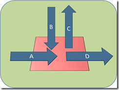
Intuitively, selection is typically mapped to a moment of contact transition between the user’s finger and the object to be selected. To understand the myriad of selection methods, I will refer to Figure 1 regularly:

image

Figure 1. Various contract transition types on a touch display. Classic ‘tap’ (or ‘click’) selection occurs on a B-C event: the user lowers their finger onto the object (B) and removes their finger from the display while still in contact (C). A and D represent the user sliding their finger along the screen to enter the object (A) or exit it (D).

The various combinations of these transitions into selection events have been studied by a variety of researchers and technologists. Several combinations of entry events (A,B) and exit events (C,D) have been combined to create selection events.

Tap: B-C Selection

Tap selection is a classic, in that it mimics the mouse: the finger comes down on the object, and is lifted from the screen while still within. Here at Surface, our UR team has found that users tend to try this one first, and are sometimes blocked if Tap selection is not available.

Advantage: technique is consistently the first one tried by novice users. It also provides a clear ‘cancel’ mechanism: after touching the object, sliding the finger off of it but maintaining contact with the display aborts the selection.

Disadvantage: does not allow for chained selections (selection of more than one item in a single gesture). Requires precise touching, so on-screen targets must be large. Does not support parallelism very well, so multi-touch tap selections are likely to be sequential, rather than simultaneous.

First-Touch: A Selection

First-touch selection comes to us from Potter et al’s classic paper on touch-screen selection. The idea is simple: allow the user to put their finger down anywhere on the display. They then slide it around until they successfully touch an object, which is then selected immediately (the exit transition has no effect on the selection).

Advantages: In target-sparse environments (aka screens without a lot of selectable stuff), this can help to overcome some of the problems associated with fat fingers, discussed in detail a few weeks back. Essentially, if the user misses the target when they first touch the screen, they can simply wiggle their finger a bit to acquire it. Further, the selection event is made before the user lifts their finger from the screen, so they can continue to work. This makes multiple-selection easy, and is the method of selection in a hierarchical menu.

Disadvantages: in target-rich environments, first-touch makes it very difficult to accurately select a target. There is no cancellation mechanism.

Take-Off: C Selection

Take-off selection takes-place when the finger is lifted from the screen. This is the selection method used to enter text on the iPhone keyboard. In the original paper, Potter et al. describe the use of an offset cursor in combination with take-off, which is also done by the iPhone keyboard.

Advantages: allows for a preview of what will be selected when the finger lifts, and thus greater accuracy than First-Touch selection.

Disadvantages: unlike First-Touch selection, the finger is now off the display, so continuous actions are impossible.

Land-On: B Selection

Land-on selection is the method used by physical keyboards: as soon as the finger lands on the target, the selection is made.

Advantages: allows for intuitive selection, immediate system response when the finger lands on the screen.

Disadvantages: no opportunity to cancel the selection (as with 'tap', where the user can slide their finger off before lifting), and also is much less precise because the system cannot preview for the user which object will be selected.

Crossing: A-D Selection

Crossing selection is to 'first touch' what 'tap selection' is to land-on: the user must both enter and exit the target using the same method.

Advantage: allows the user to cancel their selection, because they can make a 'B' exit from the target to avoid selecting it. Multiple target selection is possible, as the user slides along the screen.

Disadvantage: no preview of selected items before selection is made (unless twinned with a 'first touch' visualization). Unintuitive, in that landing a finger direction on the target does not select it.

Slip-Off: B-D Selection

This selection method is traditionally used by pen-based interfaces, as it resembles a "checkmark": the user touches the stylus to the target, then slides it off of the target while on the screen.

Advantage: more intuitive than crossing, since the goal is to touch the object.

Disadvantage: multiple selection is not possible, because the stylus must be lifted before selecting an object.

Aside: What does ‘Selection’ Mean in Multi-User Systems?

Now armed with a deep understanding of various selection methods, it is important to remember not to blindly apply your favourite to a new multi-user application. It is critical that you remember that in a multi-touch system, traditional select-apply (aka ‘noun-verb’) interaction sequences don’t work without careful thought. Remember: each user may have one or more objects selected independently of one another. Providing a tool palette to then apply some action or property to those objects will lead to obvious task interference between your users (eg: user 1 wants to colour an object blue, so he selects the object, and moves his hand to select the ‘blue’ button. At the same time, user 2 decides to colour a different object red, so he selects it, and then selects the ‘red’ button. If you have not carefully designed your system, both of the objects selected by of user 1 and user 2 will now be red. Oops!).

Our Team’s Work

The Surface design team is redesigning our touch primitives, and selection mechanisms feature highly on the list. Making the right choices from among the selection event types is critical for success, and we will be focusing our energies on making the right choice.

Wednesday, November 12, 2008

Effective Design of Multi-Touch Gestures

A common immediate reaction to a high-bandwidth, multi-finger input device is to imagine it as a gestural input device. Those of us in the business of multi-touch interface design are so often confronted with comparisons between our interfaces and the big-screen version of John Underkoffler’s URP: Minority Report.

The comparison is fun, but it certainly creates a challenge – how do we design an interface that is as high-bandwidth as has been promised by John and others, but which users are able to immediately walk up and use? The approach taken by many systems is to try to map its functionality onto the set of gestures a user is likely to find intuitive. Of course, the problem with such an approach is immediately apparent: the complexity and vocabulary of the input language is bounded by your least imaginative user.

In this article, I will describe the underpinnings of the gesture system being developed by our team at Microsoft Surface: the Self Revealing Gesture system. The goals of this system are precisely to address these problems: 1. To make the gestural system natural and intuitive, and 2. To make the language complex and rich.

Two Gesture Types: Manipulation Gestures and System Gestures

The goal of providing natural and intuitive gestures which are simultaneously complex and rich seems to contain an inherent contradiction. How can something complex be intuitive?

To address this problem, the Surface team set out to examine a single issue: which gestures are intuitive to our user population? To address this, a series of simple tasks were described, and the users were asked to perform the gesture that would lean to the desired response. Eg: move this rectangle to the bottom of the display. Reduce the contrast of the display. No gestures were actually enabled in the interface: this was effectively a paper exercise. To determine which gestures occurred naturally, the team recorded the physical movements of the participants, and then compared across a large number of them. The results were striking: there is a clear divide between two types of gestures – what we have come to call system gestures, and manipulation gestures.

Manipulation Gestures are gestures with a two-dimensional spatial movement or change in an object’s properties (eg: move this object to the top of the display, stretch this object to the width of the page). Manipulation gestures were found to be quite natural and intuitive: by and large, every participant performed the same physical action for each of the tasks.

System Gestures are gestures without a two-dimensional spatial movement or change in an object. These include gestures to perform operations such as removing redeye, printing a document, or changing a font. Without any kind of UI to guide the gesture, participants were all over the map in terms of their gestural responses.

The challenge to the designers, therefore, is to utilize spatial manipulation gestures to drive system functions. This will be a cornerstone in developing our Self Revealing Gestures. But – how? To answer this, we turn to an unlikely place: hotkeys.

Lessons from Hotkeys: CTRL vs ALT

Most users never notice that, in Microsoft Windows, there are two completely redundant hotkey languages. These languages can be broadly categorized as the Control and Alt languages (forgive me for not extending Alt to Alternative, but it could lead to too many unintentional puns). It is from comparing and contrasting these two hotkey languages that we draw some of the most important lessons necessary for Self-Revealing Gestures.

Control Hotkeys and the Gulf of Competence

We consider first the more standard hotkey language: the control language. Although the particular hotkeys are not the same on all operating systems, the notion of the control hotkeys is standard across many operating systems: we assign some modifier key (‘function’, ‘control’, ‘apple’, ‘windows’) to putting the rest of the keyboard into a kinaesthetically held mode. The user then presses a second (and possibly third) key to execute a function. For our purposes, what interests us is how a user learns this key combination.

Control hotkeys generally rely on two mechanisms to allow users to learn them. First, the keyboard keys assigned to their functions are often lexically intuitive: ctrl+p = print, ctrl+s = save, and so on:

clip_image002

Figure 1. The Control hotkeys are shown in the File menu in Notepad. Note that the key choices are selected to be ‘intuitive’ (by matching the first letter of the function name).

This mechanism works well for a small number of keys: according to Grossman, users learn hotkeys more quickly if their keys map to the function names. This is roughly parallel to the naïve designer’s notion of gesture mappings: we map the physical action to some property in its function. However, we quickly learn that this approach does not scale: frequently used functions may overlap in their first letter (consider ‘copy’ and ‘cut’). This gives rise to shortcuts such as F3 for ‘find next’:

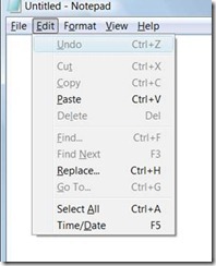
clip_image004

Figure 2. The Control hotkeys are shown in the Edit menu in notepad. The first-letter mapping is lost in favor of physical convenience (CTRL-V for paste) or name collisions (F3 for Find Next – yes F3 is a Control hotkey under my definition).

Because intuitive mappings can take us only so far, we provide a second mechanism for hotkey learning: the functions in the menu system (in the days before the ribbon[1]) are labelled with their Control hotkey invocation. This approach is a reasonable one: we provide users with an in-place help system labelling functions with a more efficient means of executing them. However, a sophisticated designer must ask themselves: what does the transition from novice to expert look like?

In the case of control shortcuts, the novice to expert transition requires a leap on the part of the user: we ask them to first learn the application using the mouse, pointing at menus and selecting functions graphically. To become a power user, they must then make the conscious decision to stop using the menu system, and begin to use hotkeys. At the time that they make this decision, it will at first come at the cost of a loss of efficiency, as they move from being an expert in one system, the mouse-based menus, to being a novice in the hotkey system. I call this cost the Gulf of Competence:

clip_image006

Figure 3. The learning curve of Control hotkeys: the user first learns to use the system with the mouse. They then must consciously decide to stop using the mouse and begin to use shortcut keys. This decision comes at a cost in efficiency as they begin to learn an all-new system. This cost is the ‘Gulf of Competence’.

The gulf of competence is easily anticipated by the user: they may know that hotkeys are more efficient, but they will take time to learn. We are asking a busy user to take the time to learn the interface. The Gulf of Competence is a chasm too far for most users: only a small set ever progress beyond the most basic control hotkeys, forever dooming them to the inefficient world of the WIMP. Thankfully we have a hotkey system that is far easier to learn: the ALT hotkeys.

Alt Hotkeys and the Seamless Novice to Expert Transition

While the Control hotkeys rely on either intuition or users willing to jump the Gulf of Competence, a far more learnable hotkey system exists in parallel to address both of these limitations: the Alt hotkey system. Like any hotkey system, the Alt approach modes the keyboard to provide a hotkey. Unlike the Control keys, however, on-screen graphics guide the user in performing the hotkey:

clip_image008 clip_image010 clip_image012

Figure 4. A novice Alt-hotkey user’s actions are exactly the same as an expert’s: no gulf of incompetence.

On-screen graphics guide the novice user in performing an Alt hotkey operation. Left: the menu system. Center: the user has pressed ‘Alt’. Right: the user has pressed ‘F’ to select the menu.

Because the Alt hotkeys guide the novice user, there is no need for the user to make an input device change: they don’t need to navigate menus first with the mouse, then switch to using the keyboard once they have memorized the hotkeys. Nor do we rely on user intuition to help them to ‘guess’ alt hotkeys.

The Alt-hotkey system is a self-revealing interface. Put another way, the physical actions of the user are the same as the physical actions of an expert user: Alt+f+o. There is no gulf of competence.

Applying Self Revealing Interfaces to Gesture Learning

Our goal on the Microsoft Surface team is to build a self-revealing gesture system that is modeled after the guiding principle of the Alt hotkeys: the physical actions of a novice user are identical to the physical actions of an expert user. Fortunately, we’re not the first ones to try to do this. As I type this, I happen to be visiting family in Toronto, overlooking the offices of the local Autodesk offices – once Alias Research. Many years ago, researchers working at Alias and at the University of Toronto built the first self-revealing gesture system: the marking menu.

Marking Menus: the First Self-Revealing Gestures

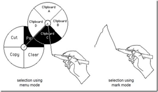
Marking ‘menu’ is a bit of misnomer: it’s not actually a menu system at all. In truth, the marking menu is a system for teaching pen gestures. For those not familiar, marking menus are intended to allow users to make gestural ‘marks’ in a pen-based system. The pattern of these marks corresponds to a particular function. For example, the gesture shown below (right) leads to pasting the third clipboard item. The system does not rely at all on making the marks intuitive. Instead, Kurtenbach provided a hierarchical menu system (below, left). Users navigate this menu system by drawing through the selections with the pen. As they become more experienced, users do not rely on visual feedback, and eventually transition to interacting with the system through gestures, and not through the menu.

clip_image014

Figure 5. The marking-menu system (left) teaches users to make pen-based gestures (right)

Just like the Alt-menu system, the physical actions of the novice user are physically identical to those of the expert. There is no Gulf of Competence, because there is no point where the user must change modalities, and throw away all their learnings. So – how can we apply this to multi-touch gestures?

Self-Revealing Multi-Touch Gestures

So – it seems someone else has already done some heavy lifting on the creation of a self-revealing gesture system. Why not use that system and call it a day? Well, if we were willing to have users behave with their fingers the way they do with a pen – we’d be done. But, the promise of multi-touch is more than a single finger drawing single lines on the screen. We must consider: what would a multi-touch self-revealing gesture system look like?

First, a quick gesture on what a ‘gesture’ really is. According to Wu and his co-authors, a gesture consists of 3 stages: Registration, which sets the type of gesture to be performed, Continuation, which adjusts the parameters of the gesture, and Termination, which is when the gesture ends.

clip_image016

Figure 6. The three stages of gestural input, and the physical actions which lead to them on a pen or touch system. OOR is ‘out of range’ of the input device.

In the case of pen marks, registration is the moment the pen hits the tablet, continuation happens as the user makes the marks for the menu, and termination occurs when the user lifts the pen off the tablet. Seems simple enough.

When working with a pen, the registration action is always the same: the pen comes down on the tablet. The marking-menu system kicks in at this point, and guides the user’s continuation of the gesture – and that’s it. The trick in applying this technique to a multi-touch system is that the registration action varies: it’s always the hand coming down on the screen, but the posture of that hand is what registers the gesture. On Microsoft Surface, these postures can be any configuration of the hand: putting a hand down in a Vulcan salute maps to a different function than putting down three fingertips, which is different again from a closed fist. On less-enabled hardware, such as that supported by Win 7 or Windows Mobile 7, this is some combination of the relative position of multiple fingertip positions. None the less, the problem is the same: we now need to provide a self-revealing mechanism to afford a particular initial posture for the gesture, because this initial posture is the registration action which modes the rest of the gesture. Those marking menu guys had it easy, eh?

But wait – it gets even trickier.

In the case of marking menus, there is no need to afford an initial posture, because there is only one of them. On a multi-touch system, we need to tell the user which posture to go into before they touch the screen. Uh oh. With nearly all of the multi-touch hardware we are supporting, the hand is out of range right up until it touches the screen. Ugh.

So, what can be done? We are currently banging away on some designs – but here’s some intuition:

Idea 1: Provide affordances for every possible initial posture, on every possible position on the display. This doesn’t seem very practical, but at least it helps you to understand the scope of the problem: we don’t know which postures to afford, nor do we know where the user is going to touch before it’s too late. So, the whole display is a grid of multi-touch marking menus. Let’s all that plan C.

Idea 2: Utilize the limited, undocumented (ahem) hover capabilities of the Microsoft Surface hardware (aka – cheat ;). With this, we know where the user’s hand is before they touch. We still display all the postures, but at least we know where to do it.

Idea 3: Change the registration action. If you found yourself asking a few paragraphs ago, ‘why does gesture registration have to happen at the moment the user first touches the screen?’, you’ve won… well, nothing. But you should come talk to me about an open position on my team. So, the intuition here is: let the user touch the screen to tell us where it is they want to perform the gesture. Next, show on-screen affordances for the available postures and their functions, and allow the user to register the gesture with a second posture, in approximately the same place as the first. From there, have the users perform manipulation gestures with the on-screen graphics, since, as we learned oh so many paragraphs ago: manipulation gestures are the only ones that users can learn to use quickly, and are the only ones that we have found to be truly ‘natural’.

Our work isn’t far enough along yet to share broadly, but watch this space soon. Soon enough – we hope to have a fully functioning, self-revealing multi-touch gesture system ready to share.

Our Team’s Work

Over the next several months, we will be building the gesture set for the Microsoft Surface. It is our intention that this rich set of gestures will define the premium touch experience in a Microsoft product, and that this experience will be taken and scaled to other platforms in future. Once we have developed the gesture language we want to perform, we’ll adapt our best thinking on the self revealing gestures to making this rich, complex gesture set seem intuitive to the user – even if it isn’t really. Neat, huh?


[1] I will set aside a rant about how the Ribbon has attacked hotkey learning. If you happen to work on that project, however, I implore you: hotkey users are rare, but they are our power users and are our biggest proponents. In moving from office 2003 to office 2007, I went from being a power user, never having to touch the mouse, to a complete novice. Other power users have told me harrowing tales of buying their own copies of Office 2003 when their support teams stopped making it available.